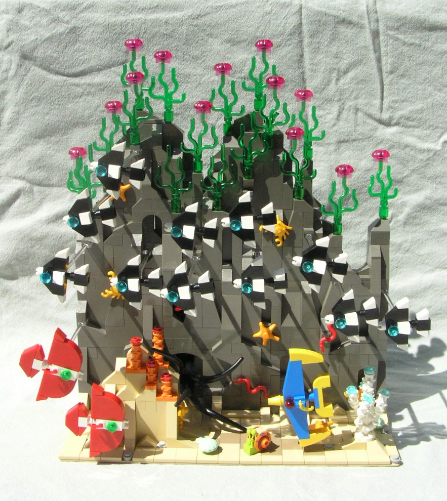
So the theme was decided: School. Any kind of school, even fish. I immediately latched onto that and the gears began turning. I hadn't made a diorama in quite awhile, so I began thinking back on all the nature documentaries I've seen and I dove right in!
I came up with three different fish designs, the one school being born out of the design I was able to replicate the most. At first all three designs were quite similar, but I later made a few part substitutions for the eyes, mouth and fins to make them a little more distinctive.
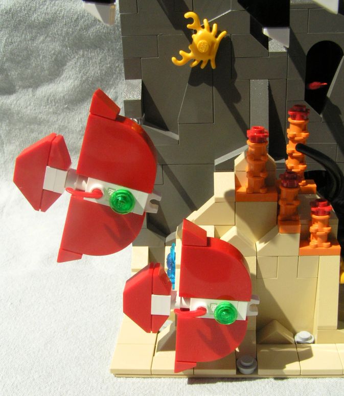
The smallest Castle/Pirate helmet feather made a great side fin.
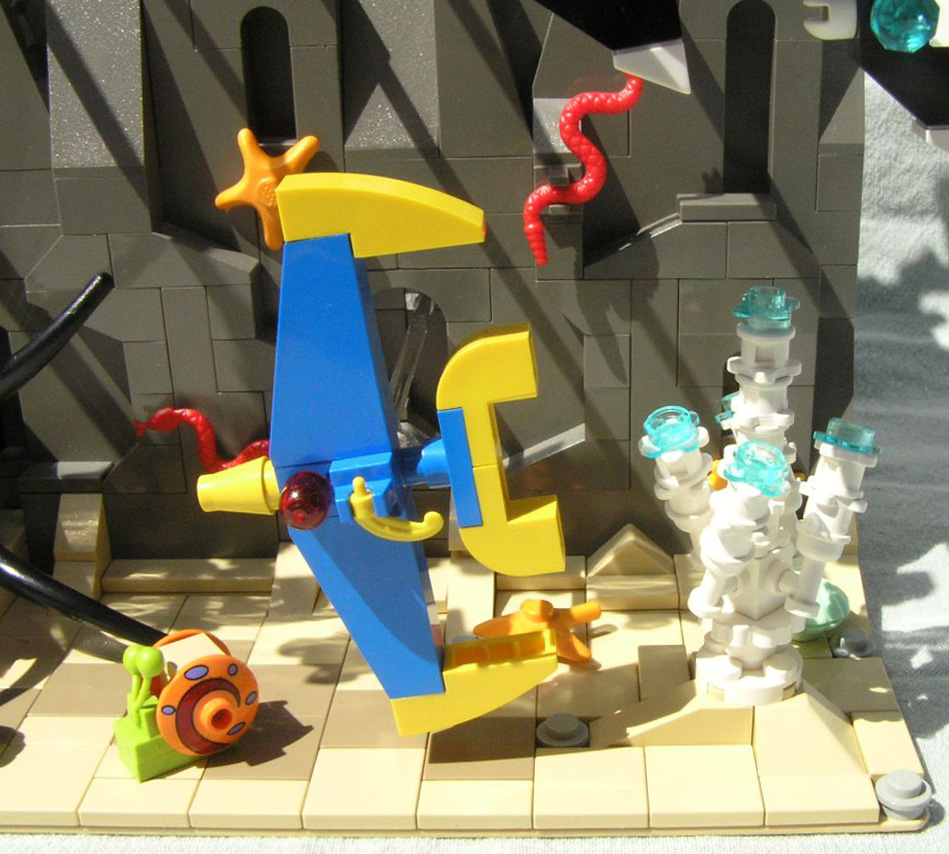
The coral designs were challenging and fun. I considered putting in SpongeBob and Patrick mini-figs with their jellyfish nets, but I didn't want them to confuse the theme. However, Gary was a perfect fit!
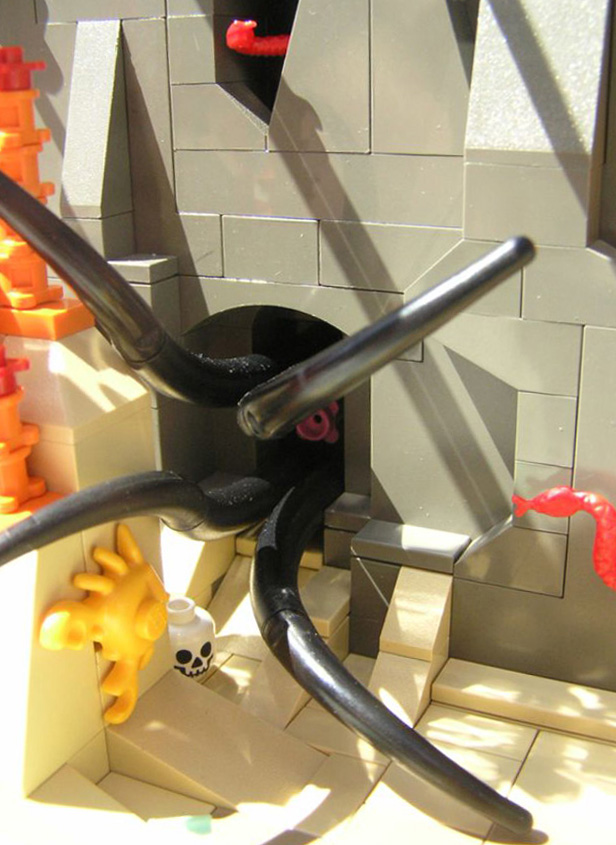
There was just enough space between the three large BURPs for something hiding in a cave. A few tentacles and a pink flower top gave me a lurking squid.
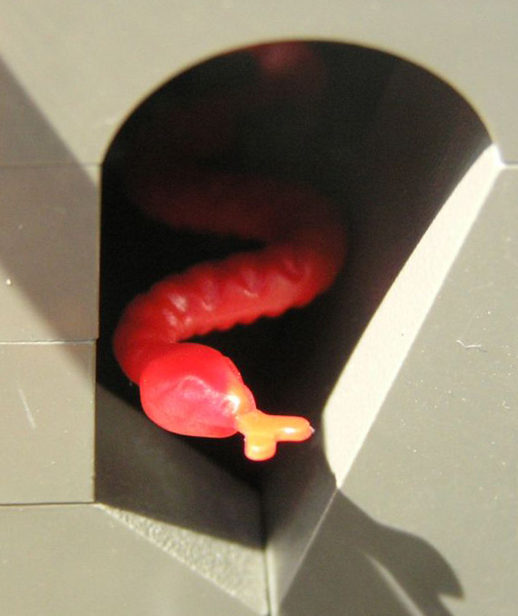
This macro shot not only got the detail on the snakes' head, but the sunlight also added an extra dash of color. SSSSSSSSSS!
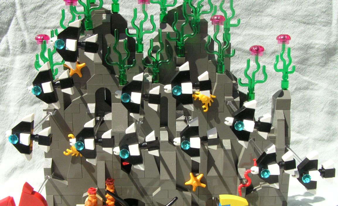
The new 1x1 brick with studs on opposing sides was terrific for the tails. I love the control stick base for the mouth as well. The most challenging part was determining the placement of the clear mounting rods so that each fish was appropriately spaced on all three axes.
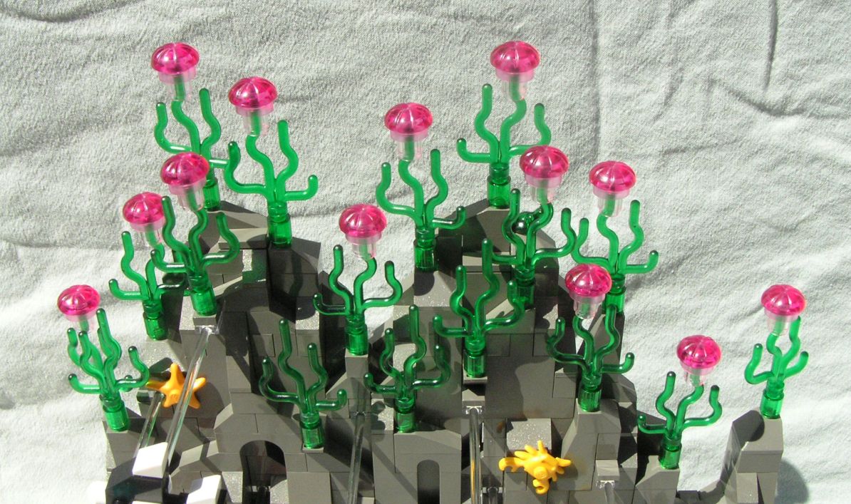
BZZZZZZZZZZZZZZZZZZZZZZZZZZZZZZZZZZZZ! I was really jazzed at how the color of trans-pink in the chef'e hat piece was fainter around the rim, since it made the transition to the 1x1 clear cylinder much smoother and more organic-looking.

So the theme was decided: School. Any kind of school, even fish. I immediately latched onto that and the gears began turning. I hadn't made a diorama in quite awhile, so I began thinking back on all the nature documentaries I've seen and I dove right in!
I came up with three different fish designs, the one school being born out of the design I was able to replicate the most. At first all three designs were quite similar, but I later made a few part substitutions for the eyes, mouth and fins to make them a little more distinctive.

The smallest Castle/Pirate helmet feather made a great side fin.

The coral designs were challenging and fun. I considered putting in SpongeBob and Patrick mini-figs with their jellyfish nets, but I didn't want them to confuse the theme. However, Gary was a perfect fit!

There was just enough space between the three large BURPs for something hiding in a cave. A few tentacles and a pink flower top gave me a lurking squid.

This macro shot not only got the detail on the snakes' head, but the sunlight also added an extra dash of color. SSSSSSSSSS!

The new 1x1 brick with studs on opposing sides was terrific for the tails. I love the control stick base for the mouth as well. The most challenging part was determining the placement of the clear mounting rods so that each fish was appropriately spaced on all three axes.

BZZZZZZZZZZZZZZZZZZZZZZZZZZZZZZZZZZZZ! I was really jazzed at how the color of trans-pink in the chef'e hat piece was fainter around the rim, since it made the transition to the 1x1 clear cylinder much smoother and more organic-looking.